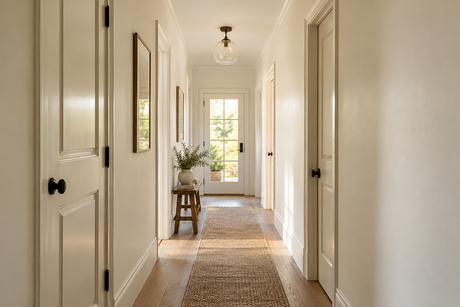
Light colors reflect more light and can make a room feel less enclosed. White, pale beige, soft gray, light blue and muted green are common choices.
Avoiding a very harsh contrast between walls and ceiling can make the space feel more continuous.
Natural light, furniture size, curtains and flooring also influence how spacious a room feels.
Continuity and contrast
Light walls alone do not guarantee a spacious impression. The relationship between ceiling, doors, curtains and furniture also matters. Large surfaces with less contrast can create continuity. Keeping a strong accent in one area and simplifying transitions often produces a calmer result.
Adapt it to the room
In a narrow hallway, similar door and wall shades can soften the number of visible boundaries. A very cool pale color may feel harsh in a dark room, so test a warm neutral too. Do not choose high sheen solely for a sense of space: it can make imperfections more noticeable. Evaluate color, lighting and furniture placement together.
Before deciding
- Assess the shade in the actual room under its intended lighting.
- Compare flooring, furniture and textiles beside the sample.
- Record product, color code and sheen together.
Must every surface be white?
No. The relationship between light and contrast matters more. Different white undertones can still create strong boundaries. Compare samples together and include the floor color in the decision.