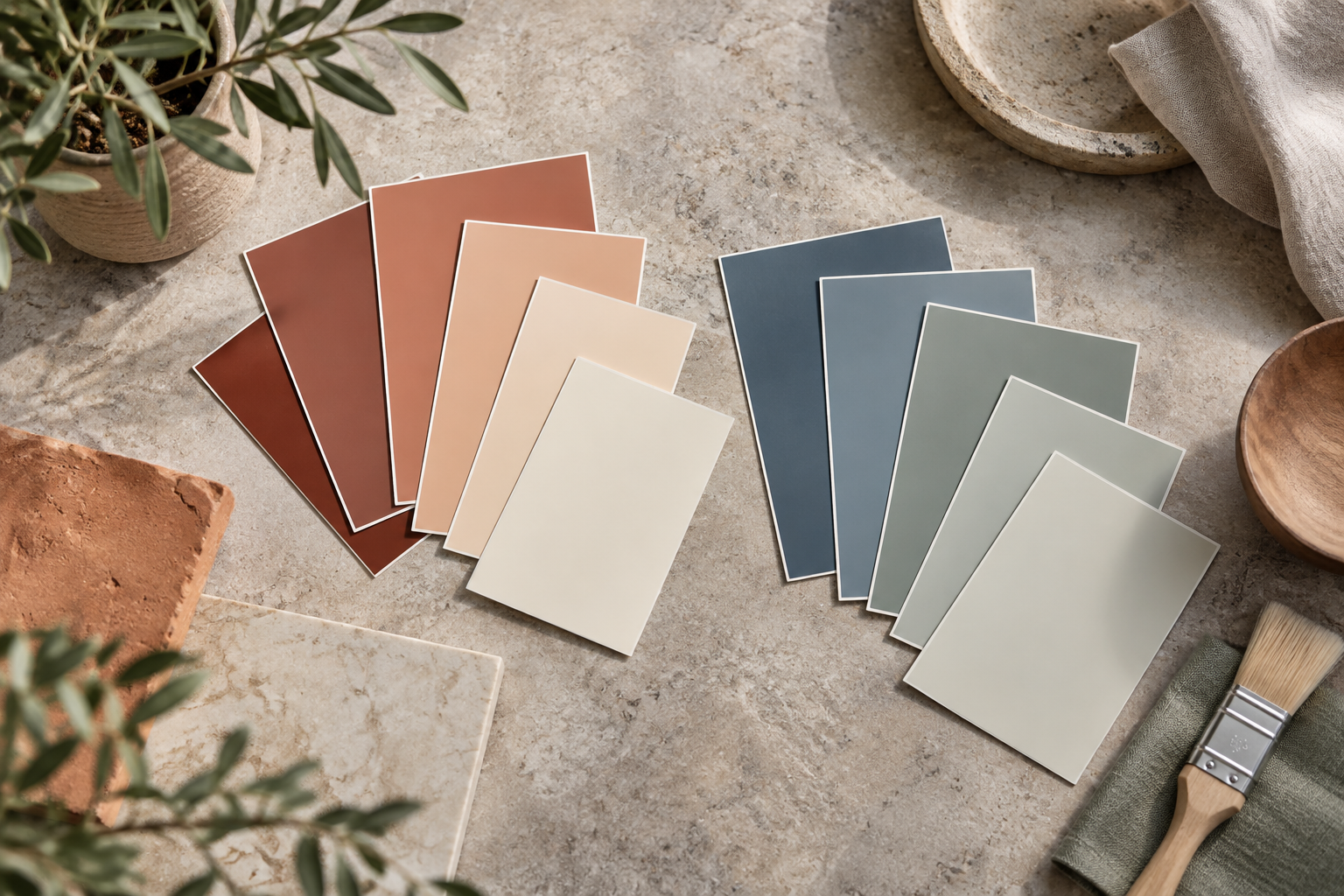
Warm beige, cream, terracotta and brown undertones can make a room feel more welcoming. Blue, some greens and cool grays can create a calmer atmosphere.
In rooms with limited daylight, very cool shades may feel harsher, while strong sunlight can be balanced by cooler colors.
Even white and gray can have warm or cool undertones, so test the exact shade in the room.
Identify the undertone
Warm and cool are not limited to yellow and blue. Comparing two whites or two grays side by side often reveals their undertones more clearly. Test beside wood, stone and textiles. A shade that looks neutral alone can appear warm or cool next to another color.
Create a balance
A cool wall with warm flooring can be a deliberate contrast rather than a mismatch. Base the decision on samples tested in the same room. A gray-blue shade may feel cooler in a room with north-facing light, for example. Finalize the lighting before approving the palette, and do not treat a catalog color name as a technical measurement.
Before deciding
- Assess the shade in the actual room under its intended lighting.
- Compare flooring, furniture and textiles beside the sample.
- Record product, color code and sheen together.
Can warm and cool colors mix?
Yes. For deliberate contrast, let one lead and the other support it. Test with the room's actual materials rather than treating a general palette guideline as an absolute prohibition.